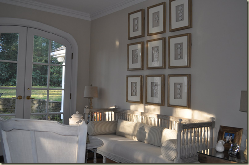
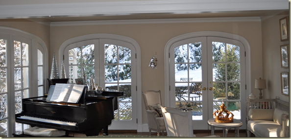
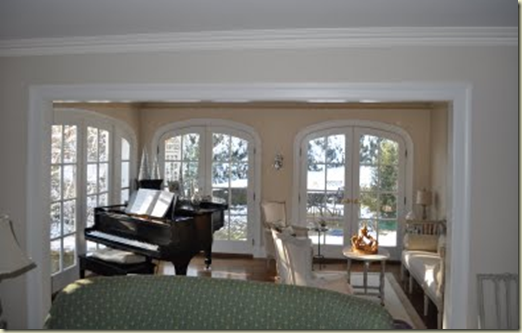
You have all followed the décor of my Conservatory.
My wonderful framed intaglios, (Dave hanging them just right), my crystal and mercury glass holiday decorations, landscaping the gardens beyond. But, what you may not know, is how little this room has been used over the past year.
You see I believe this is one of the most beautiful rooms in my home. I used to love to sit with my children and listen to them practice scales and new songs. But alas, homework, sports and friends have distracted them and sadly I am giving up every Mother’s fight “You need to practice your piano!” – They have moved on to other things and finally so must I.
<` href="http://lh3.ggpht.com/-K6yTOjCAaFk/TqSi9qm0ejI/AAAAAAAAHH0/qU0GNZazC5A/s1600-h/Conservatory-3_thumb1%25255B2%25255D.png">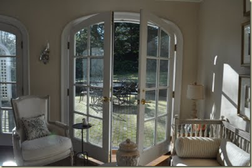
So what to do with this room? My husband has always wished for a library. A wonderful wood paneled space to work, read and relax. So we have decided to say goodbye to the piano and hello to a new library.
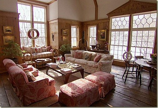
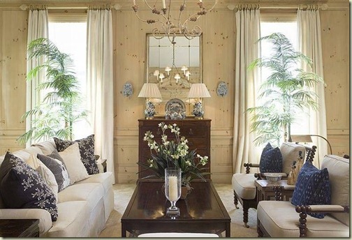
Here are some of my inspiration photos. This is Christie Brinkley’s Great Room of her Tower Hill home. Not quite a library but I have always loved the light wood and the detailing on her crown molding. The room is beautiful, and with windows on two sides the light is similar to my Conservatory.
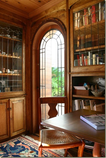
This has been in my files for a long time. I found this wonderful room on MLS. I adore the wood ceiling, leaded glass bookcases and glass arched door.
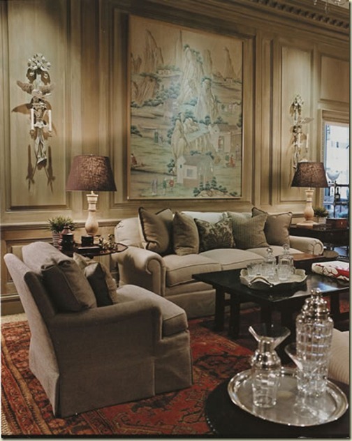
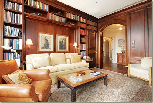
This room, from Mrs. Howard, really shows the type of wood I want. I love the paneling, although this room has much higher ceilings and is much more grand than my smaller space.
These light tones are perfect, but I do not like so many knots in the wood. This room also from Mrs. Howard.
I am sure you remember my adoration of David Easton’s library in Aspen. This light wood is limed and then washed with grey antiquing glaze. This is interesting as my painted doors will need to be stripped and a glaze may make the new wood and the old wood much easier to match.
If you look closely you will notice I only have one wall for bookcases to the right. It is also very narrow from wall to door molding. The Conservatory is very open to the Living Room right now, so I will need to add some doors. I want to keep the light coming in and do not want to lose too much space with swinging doors. I love pocket doors but I am afraid it will close off the room too much. However, it would give me another area for more bookcases. Hmm – lots of choices to make.
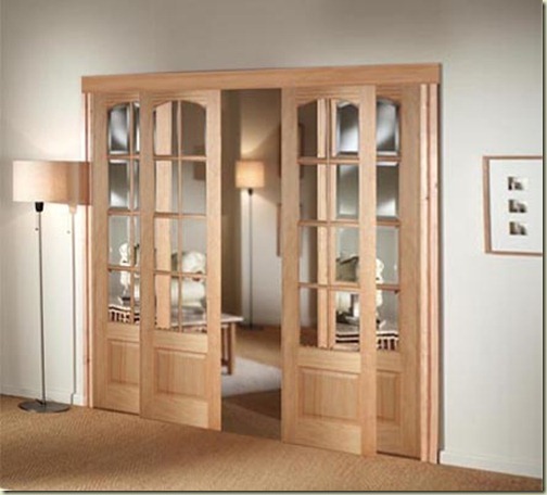
These glass does are similar to what I want. They slide over themselves so I won’t lose any space, but I prefer them to have glass to the floor.
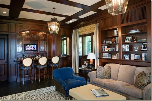
I like the arch over the bar in this library. It mimics the arches of my French doors. I wonder if my wall with the intaglios should have an bookcase with and arch.
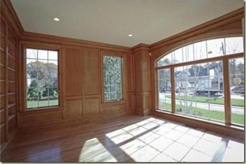
Here is a wonderful arched window in a library just being built down the street from me. The bookcase is straight, even though the main window has an arch.
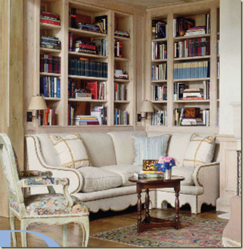
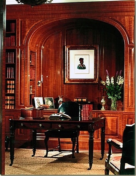
I love the niche in this library for the couch. If I create a niche I think I would place Dave’s desk in front of it but should the niche be arched? I think this niche would have looked great with an arch.
This Library from Fairfax and Sammons is a bit closer to what I was thinking, but the arch is much too deep for my space. It would definitely need to be scaled back.
I am hoping to have the sketches done by the end of November, but as you can see we are still in the design phase, so let me know your thoughts! Light wood or darker wood? Stained or Glazed? Glass sliding doors or closing in the room a bit with pocket doors? Arched bookcase or straight? This is turning into such a fun project! Excited to hear your thoughts!

No comments:
Post a Comment